

POP-UP FORM GUIDE
POP-UP FORM GUIDE
Your emails mean nothing if only a few people are getting them. You can more than double your welcome flow revenue with a good pop-up form.
Learn how to optimise and leverage pop-up forms to expand your email list.
Your emails mean nothing if only a few people are getting them. You can more than double your welcome flow revenue with a good pop-up form.
Learn how to optimise and leverage pop-up forms to expand your email list.
Watch the video below to learn more 👇
Watch the video below to learn more 👇
Why Are Pop-Up Forms So Vital for 2025?
Why Are Pop-Up Forms So Vital for 2025?
Why Are Pop-Up Forms So Vital for 2025?
Ads bring people to your site. Pop-up forms start the process of warming them up to purchase again and again by getting them on your email list.
Due to increased competition in the e-commerce space in 2025 it's NOT POSSIBLE to convert cold prospects to paying consumers anymore. The ONLY people that will buy from you are people that know and trust you and your product(s). This is where the content comes in. By content I mean the email campaigns and flows. Over time, they warm up the prospect to the point of purchase by answering questions, overcoming objections and keeping you in the front of their minds. BUT these emails only work IF they're on your email list.
THIS IS WHERE POP-UP FORMS COME IN.
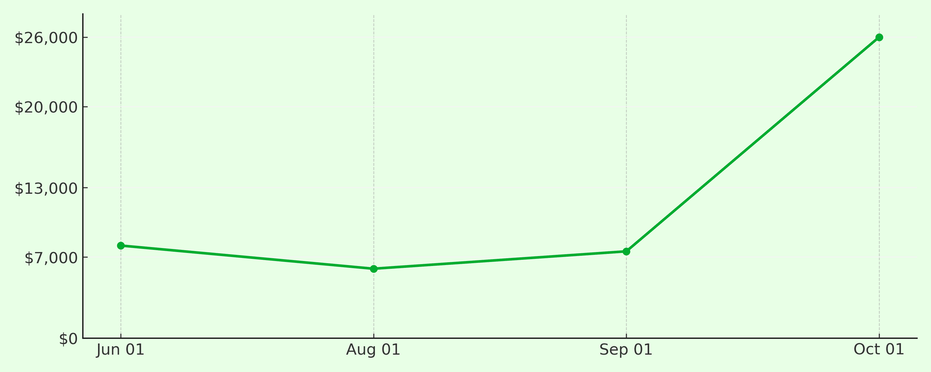
An average pop-up form can convert between 1-3% of site traffic into email opt-ins. We aim for at least TRIPLE that on average.
Boost your welcome flow revenue by getting more email subscribers:
Ads bring people to your site. Pop-up forms start the process of warming them up to purchase again and again by getting them on your email list.
Due to increased competition in the e-commerce space in 2025 it's NOT POSSIBLE to convert cold prospects to paying consumers anymore. The ONLY people that will buy from you are people that know and trust you and your product(s). This is where the content comes in. By content I mean the email campaigns and flows. Over time, they warm up the prospect to the point of purchase by answering questions, overcoming objections and keeping you in the front of their minds. BUT these emails only work IF they're on your email list.
THIS IS WHERE POP-UP FORMS COME IN.
An average pop-up form can convert between 1-3% of site traffic into email opt-ins. We aim for at least TRIPLE that on average.
Boost your welcome flow revenue by getting more email subscribers:
Bad Pop-up Form Etiquette
Bad Pop-up Form Etiquette
9 Ways To Leave Revenue On The Table With A Low Converting Pop-up Form:
Set and Forget
'It's easy to implement a pop-up form! Just apply a plug-and-play Klaviyo form and leave it. Right?'
You can, if your goal is to set money on fire. It doesn't matter if the pop-up form ticks all the boxes, it's very likely to be sub-optimal. The only way to make sure you're implementing a high converting pop-up form is through constant iteration and testing, making small changes every time.
Theres no one size fits all. Perhaps a simpler smaller 2 stage pop-up form works best with your ICP or maybe they respond better to a set '£10 Off' offer as opposed to a percentage off.
Testing is the key to taking a form converting 1-3% of site traffic to opt-ins to one converting 8-12%.
Too Much Work For The Visitor
We've all seen the forms where it feels like they're asking to know everything about you including your favourite ice cream flavour. Instant close.
Ain't nobody got time for that, keep it simple, keep to one piece of information at a time. First email, then if submitted a phone number for SMS. Otherwise that form is getting closed instantly.
If the reward isn’t immediate or exciting, they’ll bounce.
💡 Fix: Give something now — a mystery code, a freebie, or priority access.
💡 Fix: Give something now — a mystery code, a freebie, or priority access.
💡 Fix: Give something now — a mystery code, a freebie, or priority access.

Your Offer Just Isn't Worth The Effort
Your Offer Just Isn't Worth The Effort
Why should they care? If the answer isn't instant and obvious, they won’t.
💸 Weak Discount? Weak Results.
“Sign up for 10% off” might sound generous…
But if your AOV is £300+, a flat “£30 off” lands harder.
Why should they care? If the answer isn't instant and obvious, they won’t.
💸 Weak Discount? Weak Results.
“Sign up for 10% off” might sound generous…
But if your AOV is £300+, a flat “£30 off” lands harder.
💡 Fix: Match your offer type to your average order value.
💡 Fix: Match your offer type to your average order value.
💡 Fix: Match your offer type to your average order value.
🧊 Cold Offer = Cold Traffic
Saying “join our newsletter” is like asking someone to shake hands in a blizzard.
🧊 Cold Offer = Cold Traffic
Saying “join our newsletter” is like asking someone to shake hands in a blizzard.
💡 Fix: Heat things up with emotional triggers:
“Get £10 off your first gym set”
“Unlock early access to tomorrow’s drop”
💡 Fix: Heat things up with emotional triggers:
“Get £10 off your first gym set”
“Unlock early access to tomorrow’s drop”
💡 Fix: Heat things up with emotional triggers:
“Get £10 off your first gym set”
“Unlock early access to tomorrow’s drop”
📊 Would You Sign Up?
Be honest, if you were a first-time visitor, would your own pop-up convince you?
📊 Would You Sign Up?
Be honest, if you were a first-time visitor, would your own pop-up convince you?
💡 Fix: Run the “Stranger Test.” If it wouldn’t hook a cold lead in 3 seconds, rewrite it.
💡 Fix: Run the “Stranger Test.” If it wouldn’t hook a cold lead in 3 seconds, rewrite it.
💡 Fix: Run the “Stranger Test.” If it wouldn’t hook a cold lead in 3 seconds, rewrite it.
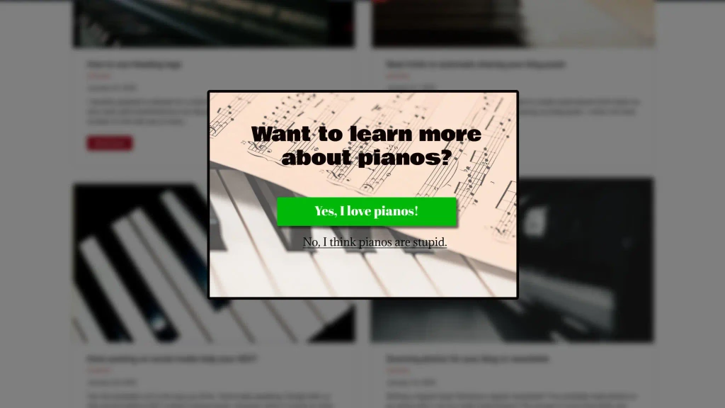
Below is an example of a BAD offer:
Below is an example of a BAD offer:
Wrong Time Delay
Timing isn’t just tactical, it’s everything.
🚨 Too Early = Instant Close
Hit them with a pop-up before they’ve even scrolled?
Their reflex kicks in: ❌ Close.
Timing isn’t just tactical, it’s everything.
🚨 Too Early = Instant Close
Hit them with a pop-up before they’ve even scrolled?
Their reflex kicks in: ❌ Close.
💡 Fix: Let them breathe. Wait 4–12 seconds before triggering.
💡 Fix: Let them breathe. Wait 4–12 seconds before triggering.
💡 Fix: Let them breathe. Wait 4–12 seconds before triggering.
⌛ Too Late = Missed Opportunity
Wait 30 seconds or more? Most visitors are already gone.
You’ll get a high conversion rate - on a tiny slice of traffic.
⌛ Too Late = Missed Opportunity
Wait 30 seconds or more? Most visitors are already gone.
You’ll get a high conversion rate - on a tiny slice of traffic.
💡 Fix: Balance engagement with exposure.
Start testing at 4s, then iterate your way up.
💡 Fix: Balance engagement with exposure.
Start testing at 4s, then iterate your way up.
💡 Fix: Balance engagement with exposure.
Start testing at 4s, then iterate your way up.
🎯 Your Sweet Spot is Hidden in the Data
The perfect delay depends on your product, landing page, and offer strength.
There’s no “universal” number, only tested results.
🎯 Your Sweet Spot is Hidden in the Data
The perfect delay depends on your product, landing page, and offer strength.
There’s no “universal” number, only tested results.
💡 Fix:
Run A/B tests at 4s, 8s, and 12s
Measure impressions × submit rate, not just conversion %
💡 Fix:
Run A/B tests at 4s, 8s, and 12s
Measure impressions × submit rate, not just conversion %
💡 Fix:
Run A/B tests at 4s, 8s, and 12s
Measure impressions × submit rate, not just conversion %
Slow Load Speed
That slow-loading pop-up? It's not “just a delay”, it’s a conversion killer.
🐌 Slow Load = Fast Exit
If your form creeps in or flickers while loading, your visitor is already reaching for the X.
That slow-loading pop-up? It's not “just a delay”, it’s a conversion killer.
🐌 Slow Load = Fast Exit
If your form creeps in or flickers while loading, your visitor is already reaching for the X.
💡 Fix: Avoid large image files, especially on mobile.
💡 Fix: Avoid large image files, especially on mobile.
💡 Fix: Avoid large image files, especially on mobile.
📱 No Images on Mobile
Mobile users are impatient. Don’t gamble their attention on animations or high-res photos.
📱 No Images on Mobile
Mobile users are impatient. Don’t gamble their attention on animations or high-res photos.
💡 Fix: Stick to text-only or minimal graphics for mobile. Keep it lightweight.
💡 Fix: Stick to text-only or minimal graphics for mobile. Keep it lightweight.
💡 Fix: Stick to text-only or minimal graphics for mobile. Keep it lightweight.
💻 Desktop? Compress or Lose
Big, beautiful imagery works better on desktop, but only if it’s fast.
💻 Desktop? Compress or Lose
Big, beautiful imagery works better on desktop, but only if it’s fast.
💡 Fix: Use compressed assets.
👉 iloveimg.com/compress-image is your best friend.
💡 Fix: Use compressed assets.
👉 iloveimg.com/compress-image is your best friend.
💡 Fix: Use compressed assets.
👉 iloveimg.com/compress-image is your best friend.
🧪 Run This Test:
Load your site on 4G.
If your popup takes more than 1 second to appear, compress or remove assets.
🧪 Run This Test:
Load your site on 4G.
If your popup takes more than 1 second to appear, compress or remove assets.
Wrong Form Size
If your form doesn’t command attention, it’ll get ignored.
🧊 Small = Skippable
Tiny pop-ups are easy to overlook and easier to dismiss. They blend into the background, not your bank account.
If your form doesn’t command attention, it’ll get ignored.
🧊 Small = Skippable
Tiny pop-ups are easy to overlook and easier to dismiss. They blend into the background, not your bank account.
💡 Fix: Avoid dainty designs. Give your form presence.
💡 Fix: Avoid dainty designs. Give your form presence.
🖥️ Desktop: Take Up Space
You’ve got the screen real estate, use it. 75%+ screen coverage is a good rule of thumb.
🖥️ Desktop: Take Up Space
You’ve got the screen real estate, use it. 75%+ screen coverage is a good rule of thumb.
💡 Fix: Make the offer large, legible, and hard to miss.
💡 Fix: Make the offer large, legible, and hard to miss.
📱 Mobile: Go Full Page
Half-screen forms feel weak and are easy to ignore.
📱 Mobile: Go Full Page
Half-screen forms feel weak and are easy to ignore.
💡 Fix: Use full-page forms on mobile to maximise engagement and limit distractions.
💡 Fix: Use full-page forms on mobile to maximise engagement and limit distractions.

Too Much Going On
Your pop-up has one job: grab attention and get a signup. But most brands try to cram in everything — and convert nothing.
📝 Too Much Copy? They Won’t Read It.
Paragraphs of fluff like “exclusive updates and product drops”? It’s all implied. It’s also all ignored.
Your pop-up has one job: grab attention and get a signup. But most brands try to cram in everything — and convert nothing.
📝 Too Much Copy? They Won’t Read It.
Paragraphs of fluff like “exclusive updates and product drops”? It’s all implied. It’s also all ignored.

💡 Fix:
Stick to under 10 words.
Let the headline + offer carry the weight.
💡 Fix:
Stick to under 10 words.
Let the headline + offer carry the weight.
🎨 Too Much Design? It’s Just Noise.
Big photos, 4 font styles, 6 colours, 3 calls-to-action… It’s not a form. It’s a panic attack.
🎨 Too Much Design? It’s Just Noise.
Big photos, 4 font styles, 6 colours, 3 calls-to-action… It’s not a form. It’s a panic attack.
💡 Fix:
Limit visuals
One CTA
One color accent (brand tone only)
💡 Fix:
Limit visuals
One CTA
One color accent (brand tone only)
📉 More Stuff = Lower Conversion
Every extra visual or line of text increases the mental “friction” and kills momentum.
📉 More Stuff = Lower Conversion
Every extra visual or line of text increases the mental “friction” and kills momentum.
💡 Fix:
Ask yourself: “Is this helping the user opt in or just making me feel clever?”
💡 Fix:
Ask yourself: “Is this helping the user opt in or just making me feel clever?”
🔬 Your Goal = Clarity
Not creativity. Not cleverness. Just clarity.
🔬 Your Goal = Clarity
Not creativity. Not cleverness. Just clarity.
The Offer Isn't Clear
If your offer isn’t obvious in the first half-second…They’re gone.
👀 If They Can’t See It, They Won’t Read It
Tiny font? Buried below 3 paragraphs of fluff? You’ve already lost them.
If your offer isn’t obvious in the first half-second…They’re gone.
👀 If They Can’t See It, They Won’t Read It
Tiny font? Buried below 3 paragraphs of fluff? You’ve already lost them.
💡 Fix: Make your offer the biggest, boldest element on the form.
💡 Fix: Make your offer the biggest, boldest element on the form.
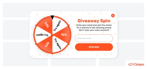
Below is an example of a CLEAR offer:
Below is an example of a CLEAR offer:

🎁 No Clear Incentive = No Email
No one joins your list just to “stay in the loop.” They want a reward, and they want it now.
🎁 No Clear Incentive = No Email
No one joins your list just to “stay in the loop.” They want a reward, and they want it now.
💡 Fix:
Use a bold headline: “Get £10 Off Your First Order”
Avoid vague language like: “Join our newsletter”
💡 Fix:
Use a bold headline: “Get £10 Off Your First Order”
Avoid vague language like: “Join our newsletter”
🔍 What to Check Instantly
Can you spot the offer in under 1 second?
Is it above the fold on mobile and desktop?
Is the font size at least 30–40px?
🔍 What to Check Instantly
Can you spot the offer in under 1 second?
Is it above the fold on mobile and desktop?
Is the font size at least 30–40px?
Too Easy to Close
Pop-up appears.
Their brain doesn’t even process the offer.
Their thumb’s already moving to the top right corner.
🧠 The Close Reflex Is Automatic
Your visitors have been trained by years of bad UX. See a pop-up? Close it fast.
Pop-up appears.
Their brain doesn’t even process the offer.
Their thumb’s already moving to the top right corner.
🧠 The Close Reflex Is Automatic
Your visitors have been trained by years of bad UX. See a pop-up? Close it fast.
💡 Fix: Interrupt that reflex. Remove or relocate the “X.”
💡 Fix: Interrupt that reflex. Remove or relocate the “X.”
🖱️ Make Them See the Offer First
Don’t trap them. Just delay the exit instinct. If you earn even one full second of attention, you win.
🖱️ Make Them See the Offer First
Don’t trap them. Just delay the exit instinct. If you earn even one full second of attention, you win.
💡 Fix:
Hide the top-right “X”
Add a clear “No thanks” button inside the form instead (e.g. “No thanks, I’ll pay full price”)
💡 Fix:
Hide the top-right “X”
Add a clear “No thanks” button inside the form instead (e.g. “No thanks, I’ll pay full price”)
🧪 Test Button Placement & Labels
Move your close action:
🔄 Top left corner
🔻 Bottom of the form
❌ Replace with “Decline Offer” CTA
🧪 Test Button Placement & Labels
Move your close action:
🔄 Top left corner
🔻 Bottom of the form
❌ Replace with “Decline Offer” CTA
Bonus Tip: Use friction. The more effort it takes to close, the more likely they are to opt-in instead.
Bonus Tip: Use friction. The more effort it takes to close, the more likely they are to opt-in instead.
How To Create A High Converting Pop-Up Form
How To Create A High Converting Pop-Up Form
Steps Overview
Create Offer - What incentive will you use?
Create Offer - What incentive will you use?
Type of Form - Choose what kind of form you want to use
Type of Form - Choose what kind of form you want to use
Create the Form - Use your desired platform to create your form.
Create the Form - Use your desired platform to create your form.
Check the Form Against Our Checklist - Use our checklist to make sure it's right.
Check the Form Against Our Checklist - Use our checklist to make sure it's right.
Set up A/B tests - Create variations, monitor results and build on them.
Set up A/B tests - Create variations, monitor results and build on them.
Define Your Offer
Your offer is the single most important element of your pop-up.
It’s what determines whether a visitor hands over their email or exits.
Ask yourself:
“Would I exchange my email for this?”
If not, your customer won’t either.
📦 Offer Types to Test:
% Off – Best for AOV under £100
£ Off – Best for AOV over £100
Mystery Discount – Add curiosity and fun
Free Gift With Order – Boost perceived value
Free Shipping – Especially effective if shipping isn’t standard
Giveaway Entry – Great for social virality
Free Guide – Educational content to build trust
Early Access – For limited drops or launches
Choose Your Form Type
Different audiences respond to different form styles — and form design is just as strategic as the offer.
Start by testing Classic and Micro Commit formats, then iterate.
🧩 Form Styles to Test:
The Classic – Straight to email input
The Micro Commit – Asks “Want 10% off?” before showing input
The Quiz – Collects segmented info before offering a discount
Spin to Win – Gamified, high-converting but playful
Uncover Your Discount – A visual reveal or scratch-to-win element

Build Your Form (Klaviyo or Amped)
Build Your Form (Klaviyo or Amped)
Use Klaviyo or Amped, the two best platforms for e-commerce pop-up forms.
Klaviyo: Great for integration and control
Amped: Premium feel and much higher performance (recommended if budget allows)
Both let you build and customize forms with split tests and integrations.
Use Klaviyo or Amped, the two best platforms for e-commerce pop-up forms.
Klaviyo: Great for integration and control
Amped: Premium feel and much higher performance (recommended if budget allows)
Both let you build and customize forms with split tests and integrations.
Run It Through This Winning Checklist
Run It Through This Winning Checklist
Before publishing, ensure your form follows this performance-proven checklist:
✅ Only one input per step (email → then SMS, not both at once)
✅ Delay trigger set to 4–12 seconds
✅ Form loads instantly with no lag
✅ Covers at least 75% of the screen
✅ Less than 10 words of copy
✅ Offer is the largest element on screen
✅ No top-right “X” use a clear internal 'Close Form' button instead
Set Up Weekly A/B Testing
Set Up Weekly A/B Testing
No form is perfect from the start.
To reach 10%+ conversion rates, you must run ongoing A/B tests.
Start with one variable at a time, such as:
Delay
Offer
Layout
Copy
Images (or none)
CTAs
Form Types
10,000 visitors +1% increase in opt-in rate = +100 new subscribers
No form is perfect from the start.
To reach 10%+ conversion rates, you must run ongoing A/B tests.
Start with one variable at a time, such as:
Delay
Offer
Layout
Copy
Images (or none)
CTAs
Form Types
10,000 visitors +1% increase in opt-in rate = +100 new subscribers
Don't Have The Time?
Need Help?
This is just a small part of what we do. Let us do the heavy lifting.
This is just a small part of what we do. Let us do the heavy lifting.